USING CHARTS IN DASHBOARDS FOR FINANCE TRACKING
To run a successful business it’s vital to have control over income, outcome, and profit. A well-designed dashboard can be an excellent tool to keep track of the economy.
Dashboards are meant to provide an at-a-glance view, with only the critical, pertinent data, and must always save the user time. Adding a responsive design to a dashboard allows the user to decide which data they want to focus on.
PROJECT OVERVIEW
The task was to design a website dashboard for a newly opened bakery. The bakery needed to track its finances to ensure success and already had a few direct competitors in its area. The dashboard would only be used on desktops or laptops.
This was school assignment, a 1-week design sprint.
METHODS
We used the Design Thinking Process as an approach to the challenge. Since we already were provided some information about the task, we worked with the understand and explore part of the method.
MY ROLE
This was a school assignment, we did the design and ideation together, but my main responsibilities were the color choices and the final mockup.
TOOLS USED
Adobe XD, Adobe Illustrator, pen and paper.
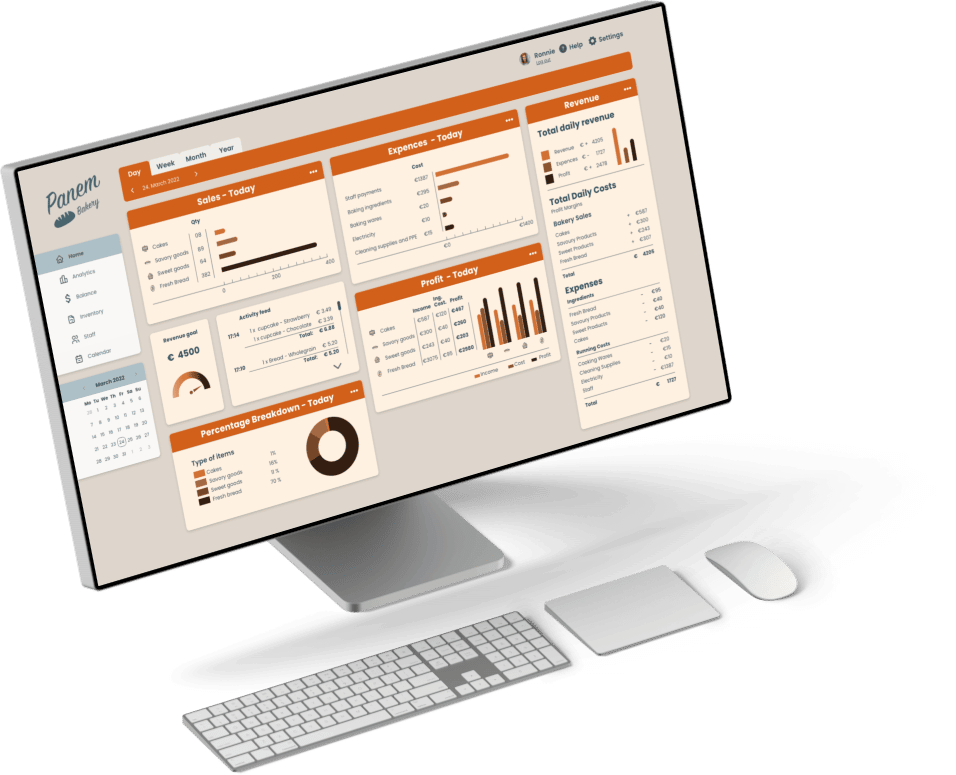
FINAL DASHBOARD

THE DESIGN PROCESS
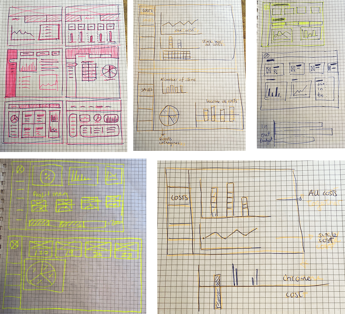
We started with a competitor analysis, comparing the design of three other bakeries. We then proceed to do some quick scetching with pen and paper.
CHARTS IN DASHBOARD
Consistency is key. All charts should use the same layout and spacing and have legends in the same position relative to the charting area. Do not switch measurement systems, like imperial to metric
USE OF COLORS
For good accessibility, we have chosen colors with high contrast and used the Stark plugin contrast checker in Adobe XD and the contrast checker from Webaim.
DESIGN CHOICES

To get easy and quick access to the different periods we added a tab bar at top of the screen, with a subheading showing the actual date. In settings, the user can decide which charts to be shown on the home screen to get a more effective view of the most important data for the user.
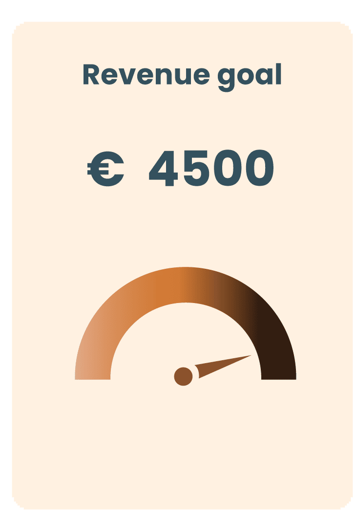
We have used a gauge chart to visualize how close/far the revenue goal is. A gauge chart is familiar and easy to understand, since the resemblance to a car speedometer or a temperature indicator. Non-technical viewers will be able to understand the value easily.

To show which kind of items sell the most, we have chosen a pie chart where it’s easy to at a glance get an overview of the balance between the sold goods.
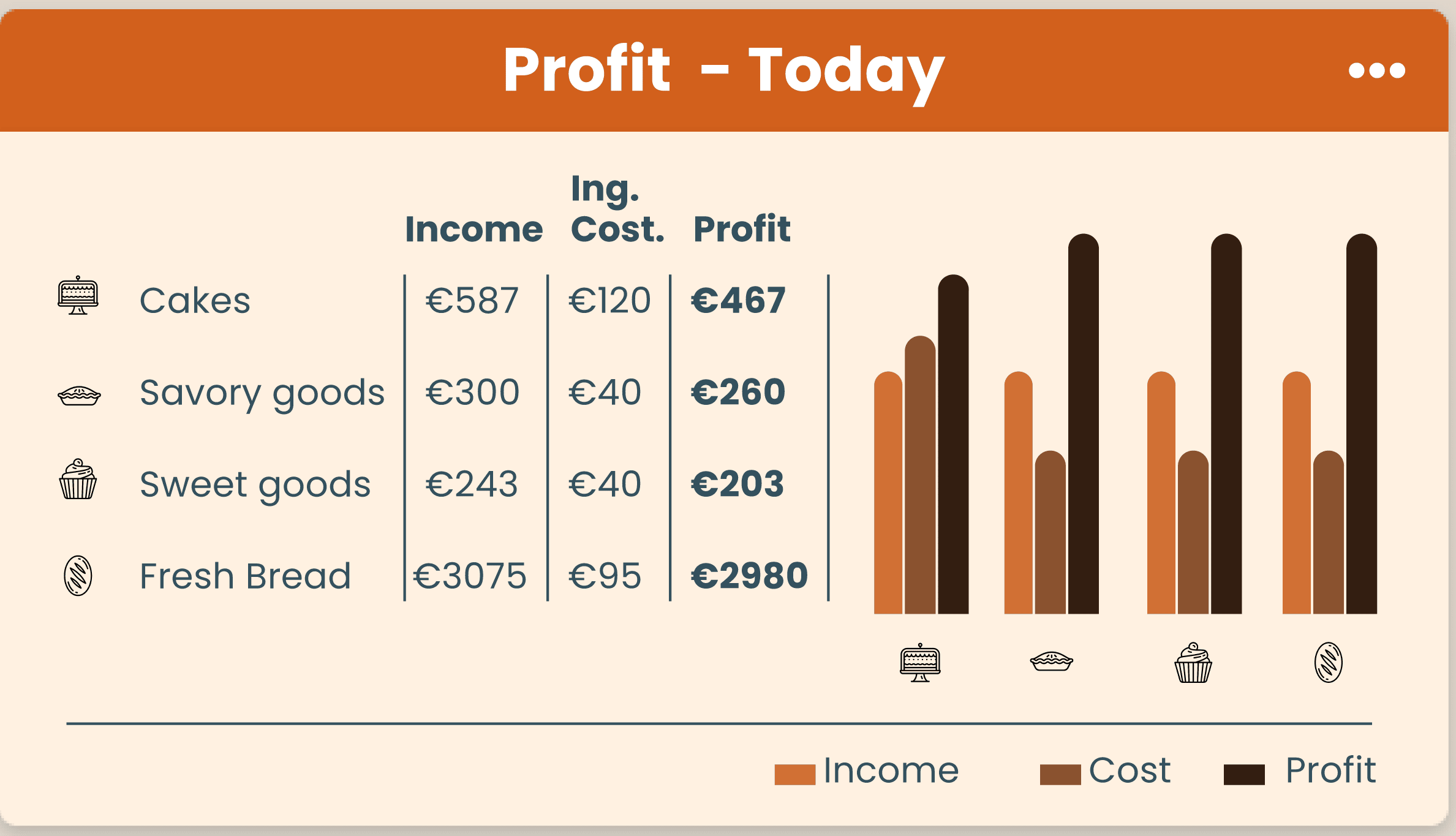
To see the profit we need a chart that can compare income and costs. We chose a group bar chart for this and also added colons for the exact numbers, as this will be hard to see with only the bars.
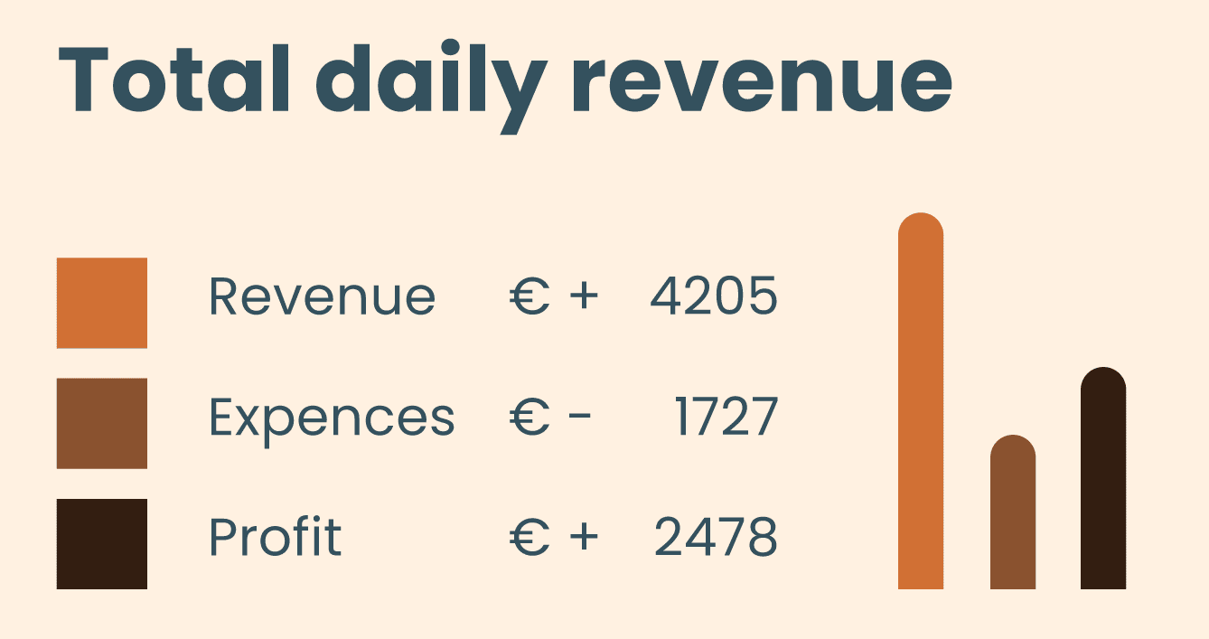
Since we can't rely only on color to show information, we have added plus and minus symbols to ensure that the user gets the right information.
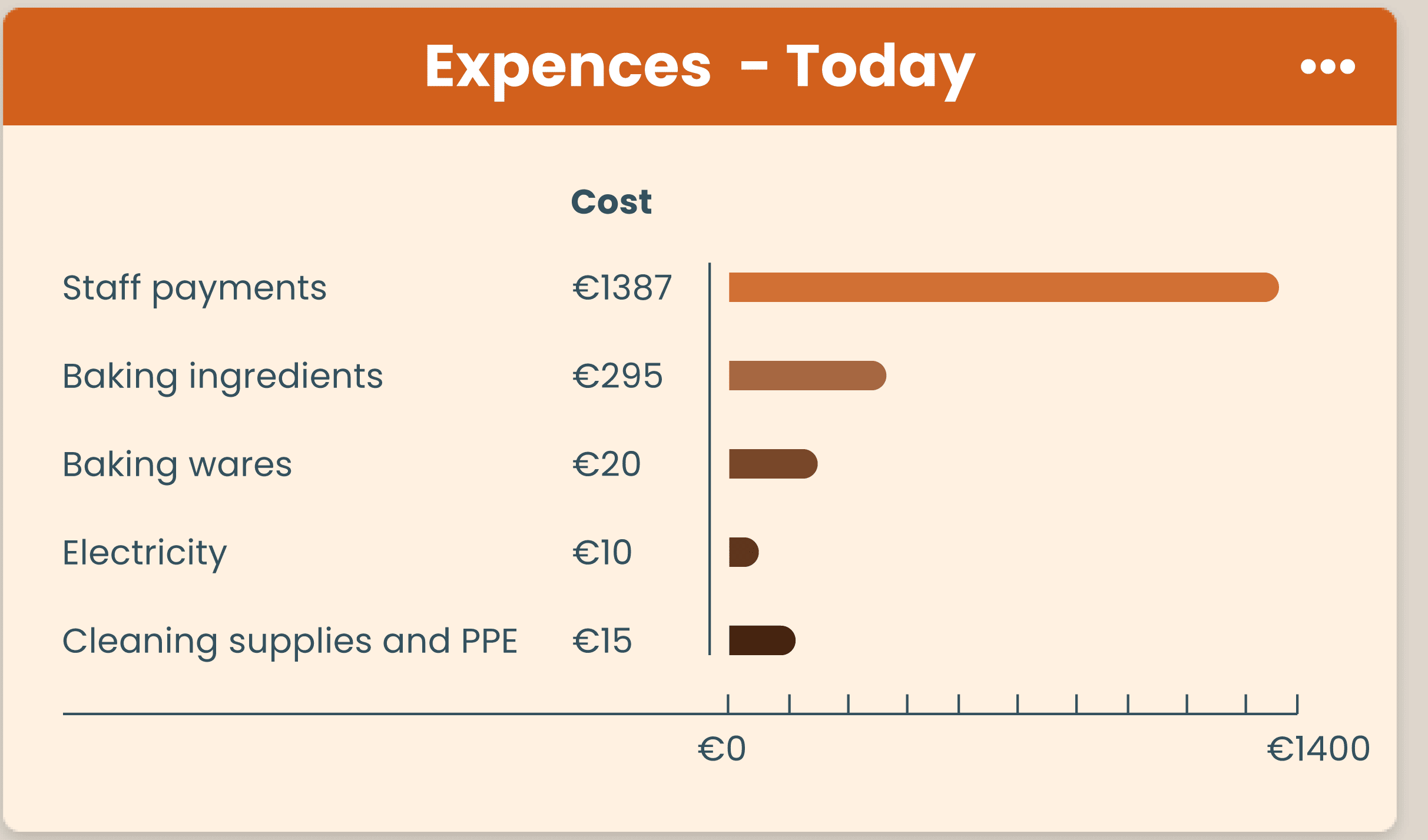

Since the user can change the view between day, week, and month, the categories stay in the same place and are not descending according to the amount. This would normally increase readability, but in this case, it would be confusing if the categories change places.